Equestrian Stockholm Fall/Winter Collection 2019
Equestrian Stockholm has just launched their Fall/Winter collection for 2019!
The 3 colours are beautifully selected (as always!). Making it quite hard for riders like myself to resist the urge to order an item or two.
Before we jump in, can we take a moment to acknowledge Equestrian Stockholm’s new logo?! Their new symbol keeps with their simple and elegant brand, but is now much more recognisable. The original two horseshoes was great, but this new E within the horseshoe is so much nicer (in my opinion).
So, after all of that, let’s take a look at this gorgeous collection.
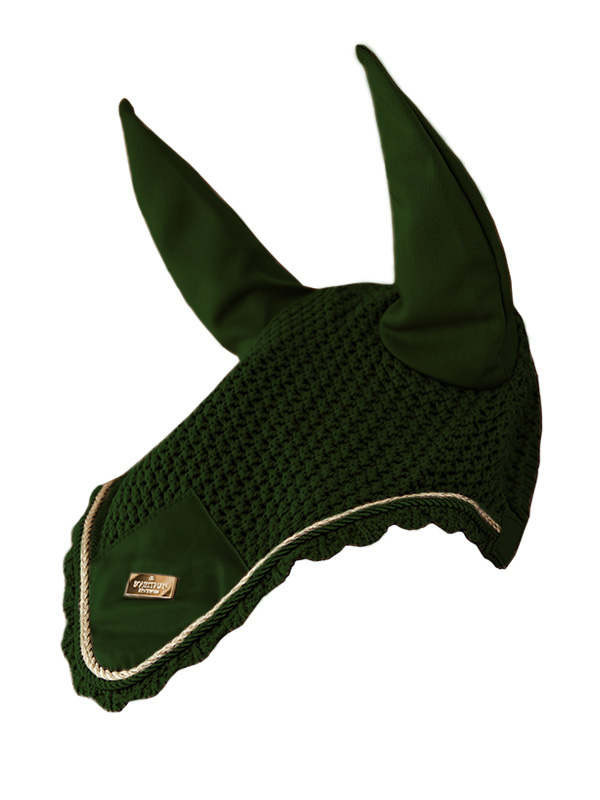
Forest Green
This green is dark enough to be a more neutral colour, but it’s still bright enough to stand out. The gold is the perfect contrast colour to the forest green. It makes the items stand out and look expensive without looking too over the top. Sure, they could have chosen to contrast the green with a black, white or navy, but it wouldn’t have the same effect. It would blend in instead of making an impact.
And in my opinion, if you’re going to spend the money on a very nice item, you want it to look like it was worth the money.
Of course, my bank account may not be happy with me. But that’s not to say that a girl can’t dream!
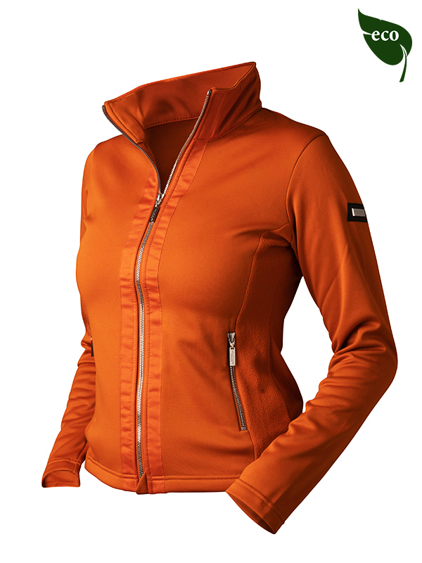
Brick Orange
It’s bright, but still sophisticated. It’s playful, but still respectable.
I’ll be honest, I’m not really drawn to orange as a colour in general. So for that reason, I would probably skip this colour.
That’s not to say that I don’t think it's a stunning colour. Because I do. I just think that it would look stunning on someone else.
Out of the three jacket styles in this collection, the orange one is my favourite. And who knows? Maybe this particular shade of orange would suit me.
I just wouldn’t take the chance ordering it in hopes that I would like the colour enough when it arrives.
But if you know that this colour suits you, I don't think you'd be disappointed. And I’m sure that you’d get an abundant number of compliments at the barn.
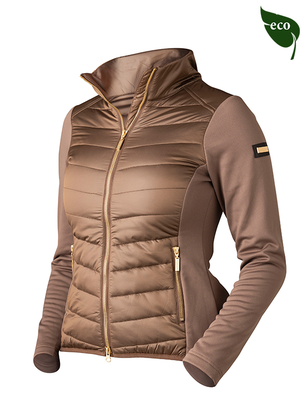
Champagne
When I first saw this colour, it was the stock photo of the saddle pad that I’ve included in this blog post.
Maybe it was the editing or the lighting, but I originally though that this colour was a bit boring. Something that I wasn’t really drawn to.
It was only when I was scrolling through Instagram that I saw the promotional pictures for the champagne colour. And I had to stop scrolling to take a closer look. This colour is such a showstopper.
The champagne colour quickly went from one of my least favourite colours from Equestrian Stockholm to one of my current top 5 colours.
This colour will definitely turn heads while still staying neutral enough to pair with any horse, tack or outfit you may be riding in.
If you’re wondering why the jackets have an eco symbol next to them, that’s because Equestrian Stockholm strives to be as eco friendly as possible.
None of their garments are made with fur or down.
They also use recycled coffee beans as a way to prevent odor build up in their jackets. That means you won’t have to wash this jacket as often as other ones. It’s a just nice way to be kinder to the environment!
I’d also love to know what your favourite colour is from this collection. Are there any items that you’ll be purchasing? Let me know in the comments below!
Until next time, happy riding!









Curious to know if the Pivo pod is worth the hype?
I was too. And I want to share my experiences with you.
Click the link to find out if what I think of it and if you should get one.